
There have been few occasions when I have sought permission to walk on private land. BC pointed out that so far we have not strayed more than a kilometre from our straight line; that is by chance rather than pre-planning, and it has kept us within the spirit of Nick Crane's Two Degrees West. BC suggested that we now attempt to keep within that limit for the rest of the walk.
Look at the first map below. It encompasses the Quernmore estate. To avoid that private land the only possible diversion would take us well beyond the one kilometre limit, and all on roads, and including a long section of the busy A683 - all more or less unacceptable, and certainly a route we would have no enthusiasm for.
We had debated various possibilities for traversing the estate but without reaching a definite plan - less said about that the better.
On this day we met at the lay-by opposite the southern entrance to the Quernmore private estate road where today's walk would finish. Whilst we were weighing this up and reading the notice a car pulled up and conversation revealed the driver to be the daughter of one of the house owners in the estate and we were given the name and phone number to contact to ask permission to walk through. Today I followed that up and permission has been granted. It is remarkable that our straight line has enabled us to plot a route largely on footpaths and with bridges over the major rivers: Wyre, Lune and Ribble, and still remaining within one kilometre of our line. I have tried this with other straight line possibilities and it is rare to be able to stick so close to the line - my unfinished Berwick-upon-Tweed to Castle Carey is a good example (I hope to continue with that, provisionally after Easter next year.)
For this walk please read the captions under the photos.

 |
| Heavy rain during the night had caused swollen fast flowing streams. For us the rain held off for the day |
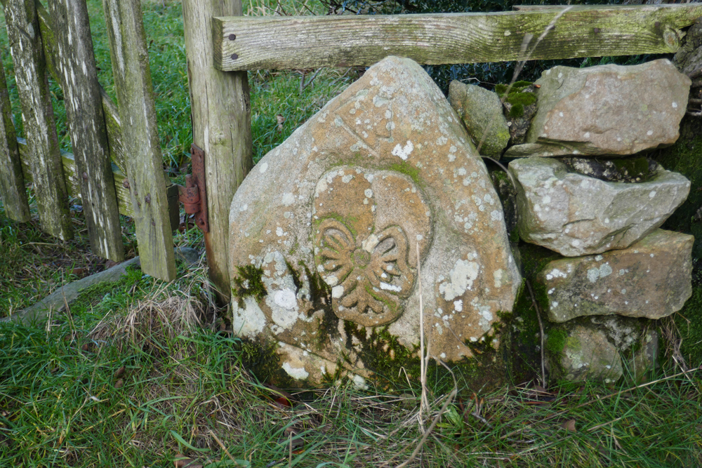 |
| We thought this may be medieval. At the farm half a mile further on we found the farmer and his wife had been on a stone carving course and created a number of similar stones which are dotted around the area |
 |
| Just before the farm we spotted these. I forgot to ask the farmer a few minutes later if they were also carved by them but guess this may be the case |
 |
| BC taking photos from a high point. There were many awkward stiles on this walk |
 |
| Jubilee Tower on road to east of our route. See photo below of an earlier visit on an even more dismal day |
 |
| If you want another story cut and paste the link. http://conradwalks.blogspot.com/search?q=Clougha+Pike |
 |
| We did manage to find a viable route through this wood |
 |
| Much of the scenery was reminiscent of the Yorkshire Dales |
 |
| The faint reddish line is our straight line |


Well done Conrad. Keep it up!
ReplyDeleteI'm interested in the presentation of your captions. Is there a rationale?
ReplyDeletePhreerunner - Thanks. It's good to know there's still somebody out there reading this stuff.
ReplyDeleteRR - No rationale. When I type the post in Blogger Dashboard the captions seem to get changed in their paragraph formatting when I publish. I have tried the "remove formatting" tool and tried again, but still resulting in erratic presentation. I do intentionally use the centre option rather than left justify to give a balanced look under the photo.
ReplyDeleteIn fact our reading eyes are not habituated to the balanced (ie, centred) look. Virtually all books and columns of type in newspapers are "justified left and right" (ie, artificially stretched by the software so that the left and right ends of the lines align with each other). This "squaring off" of type provides the reading eye with a reference when it reaches the end of one line of type and must search for the start of the next line. Very occasionally type is set "ragged right" which I hope is self-explanatory. Note: I have just previewed this comment and find that it is displayed "ragged right".
ReplyDeleteI'm surprised by your problems. In adding pic to text during the make-up of a post there is a point where, if you touch the pic with the cursor, you are provided with a list of options about caption presentation. Something similar is offered with this comment I'm creating. Below the box is the fixed line "You can use HTML tags such as..." I won't give the examples since their formatting, using < and >, would cause the computer to react to them.
It's not a bad idea to have a list of HTML instructions handy so that you can adjust type presentation in Blogger when you want. It is possible, for instance, to insert italics in the post's main headline. More specific to your problem you can code the line-breaks wherever you want them.
RR - I will have a look at all that when I do the next post. I have used html before but find it somewhat tiresome. I agree with you about readability, but in a short piece like a caption under a photo big issue
ReplyDeleteTake the photo with the thought-to-be medieval carving. The way it's set up suggests that "found" and "number of" are in some way more significant than the other words.
ReplyDeleteHTML "tiresome". Of course, you are programming. But as it stands it's HTML (or lack of it) that's ruling the roost. Parading one's weaknesses diminishes credibility.
RR - I have tried a test post (now deleted.)
ReplyDeleteIf I select "justify left" or "justify" for a caption the typing continues for the normal length one would get outside the photo box and then the next line is of course justified to the left margin. When I hit the "overview" or "publish" button the text then appears within the photo's text box confines left justified. If I select a new paragraph that is taken care of as normal except it does not give an extra line of space that is often the convention for a new paragraph but I can easily odd that if I want with an extra return key stroke. So, unless I am missing something there is no need to use HTML for those procedures, only if I want to italicise or do something more demanding.